
New design
Old design
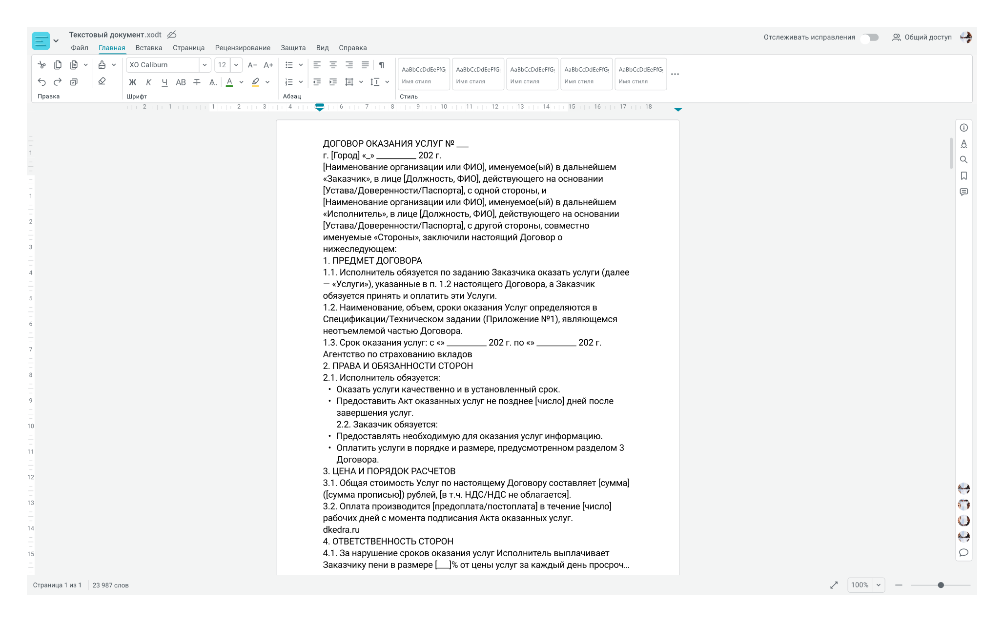
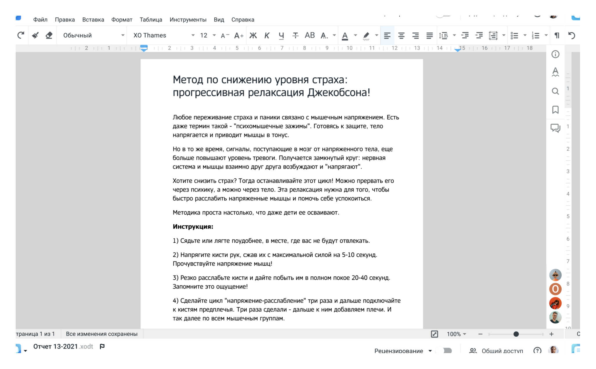
Benefits for the user:
- Speed up new user onboarding and reduce cognitive load through intuitive navigation
- Make the interface predictable and logical
Benefits for business:
- Improve SUS and CSAT metrics
- Move to design system components for consistency with other company products
- Increase product competitiveness by matching competitors in visual quality

About
Through the redesign I aimed to bring benefits to both the business and the user
Design process
- I chose a tabbed interface concept as a basis—a clear structure and hierarchy. To fill the tabs, I conducted a closed card sorting process.
- I converted the interface to icons and system design colors. This made the web editors more consistent with the company's other products. It's easier for the development team to focus on one source of truth than three.
- I pitched the redesign concept to the design department and the team.
- We divided the redesign into two phases with the development leads and RO. The goal was to complete the release.
- I prepared the final layouts and described the development documentation.
- After the release, I conducted a user survey to determine usability and satisfaction. The previous similar survey was conducted a year ago.
2.
Conducted moderated interviews on basic scenarios using Eyetracker. After the interviews, the following problem emerged:
- Complex navigation in the interface – features are becoming more numerous, and the number of entry points is increasing.
- Three icon libraries were used.
- The interface hadn't been redesigned in a long time and felt outdated and outdated.
1.

Screen test
Goal:
Name the tabs as descriptive as possible for users
Method:
The user must select 1 of 3 options for the name of the group of tools shown in the image.
Result:
Taking into account the selected options, the tabs are named in the most predictable way for users.

Closed card sorting
Goal:
Organize tools into tabs to make them most efficient for work and memorization.
Method:
Users need to arrange tools into pre-named groups.
Result:
A total of 530 respondents were surveyed in the study. Based on the analysis, the tabs were found to contain the expected content.
Research
As part of the redesign, research was conducted, much of it on the Pathway service. Some of the research is listed below.
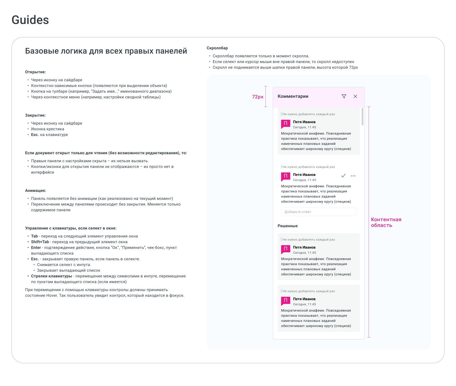

Component Guides
During the redesign implementation, the developer identified a problem in the code. A legacy of inconsistent behavior had accumulated in some UI elements. A unified behavior needed to be defined for dialog/modal windows and all right-hand panels.

Colors
To ensure a comfortable user experience and maintain a consistent brand style, we used a pastel color palette for the design system.
Icons
We migrated to a single icon library from our design system.
As part of the migration, I drew over 50 missing icons for my product.
As part of the migration, I drew over 50 missing icons for my product.
Elements of a design system
To ensure consistency with other products, we used design system elements.
Result:
- Three web editors were redesigned.
- The icon library and color library from the design system are used.
- Consistency with other company products was achieved.
- SUS increased from 63 to 65, CSAT increased from 49% to 57%.
